Lead Brand & Visual Designer
COFFEEE Club & Pub is an experimental hybrid concept designed to bridge the gap between daytime specialty coffee culture and nighttime social energy.
Introduction & Project Overview
COFFEEE Club & Pub is an experimental hybrid concept designed to bridge the gap between daytime specialty coffee culture and nighttime social energy. The core challenge was to build an eccentric, memorable brand identity that appeals to creative professionals and night owls alike, shifting seamlessly from a high-focus workspace by day to an energetic lounge by night.

The Challenge & Objectives
Brand Differentiating: Stand out in a saturated urban cafe market without losing functional accessibility.
Dual Identity: Balance the cozy, grounded warmth of a traditional artisan coffee house with the vibrant, bold atmosphere of a modern pub.
Visual Playfulness: Leverage typography and iconography that reflects modern youth culture, playfulness, and high social engagement.
Ideation & Concept Exploration
The design process began with deep exploration into how coffee culture intersects with communal spaces. Initial sketches focused on fluid typography, bean-to-cup dynamics, and stacking typography to mimic the layered experience of a bustling venue.
Concept 1: Dynamic Stack (Vector Art): Focused on bold, chunky typographic hierarchy paired with organic sweeping lines.
Concept 2: Bean-Wave: Explored fluid motion lines and integrated coffee beans to create a sense of rhythm and flow.
Concept 3: Minimalist Bloom: A refined, elegant approach utilizing a blooming coffee bean motif for a sophisticated touch.
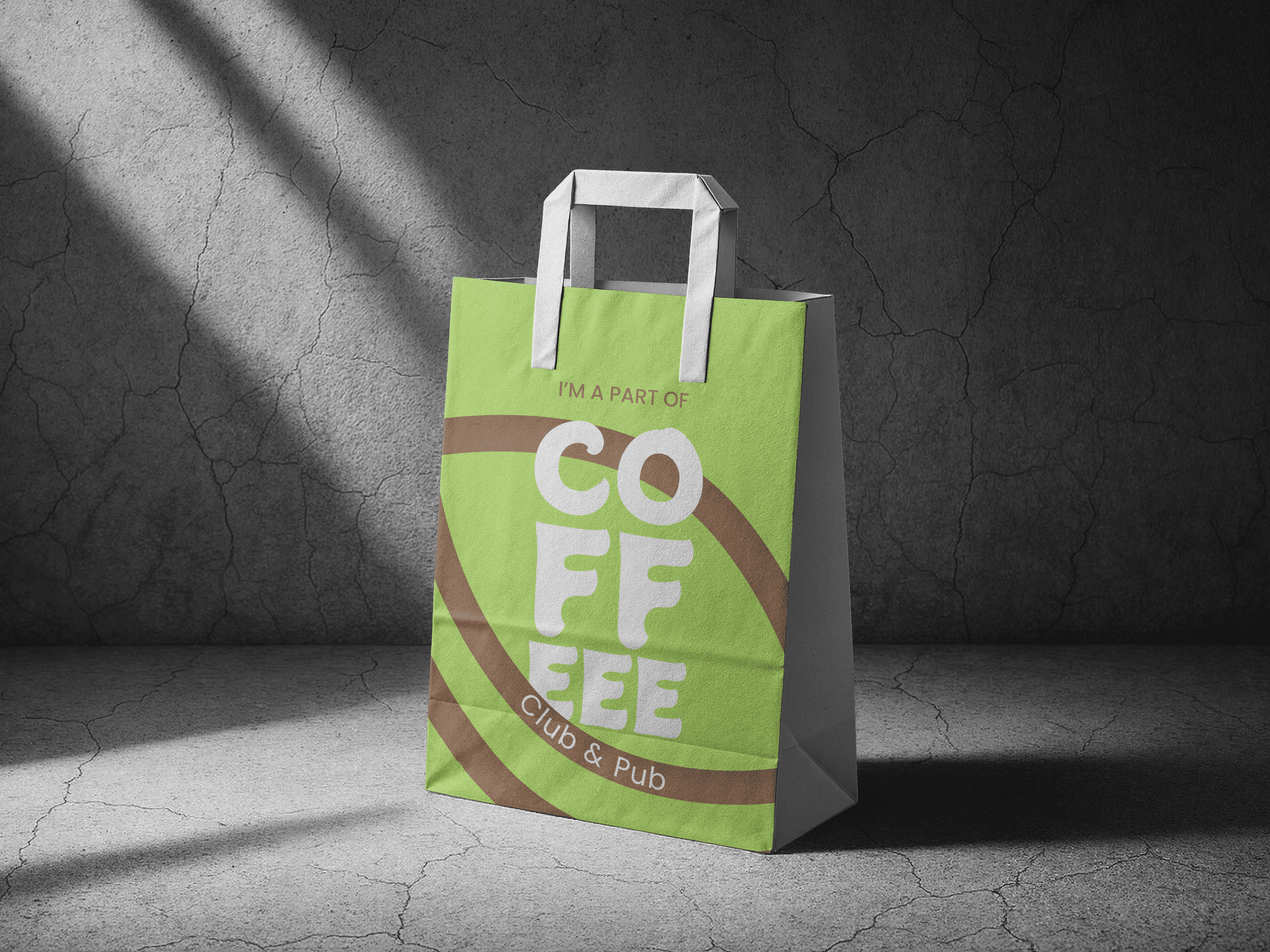
The idea is to spread awareness that our customers are a part of high end coffee community and they are proud of it!
Sugar & Coffee Sachets
Branding comes from all products sold at the counter and the customers love it. The brand owners wanted to customise coffee and sugar sachets for the brand.


The coffee packets
Brand owners wanted to be ready for coffee sales, where people get tired of visiting the cafe and want to make their coffeee at home.
The Tote Bag
If we have such a cool branding! why not scale it to merchandise! When I pitched this to owners they took it for marketing and we ended up making tote bags.

64%
users bought brand merchandise in first 30 days of opening cafe
45%
Users came back to get their cup of coffee
25%
Users were caught stealing the sugar sachets ;P
Brand Identity & Final Solution
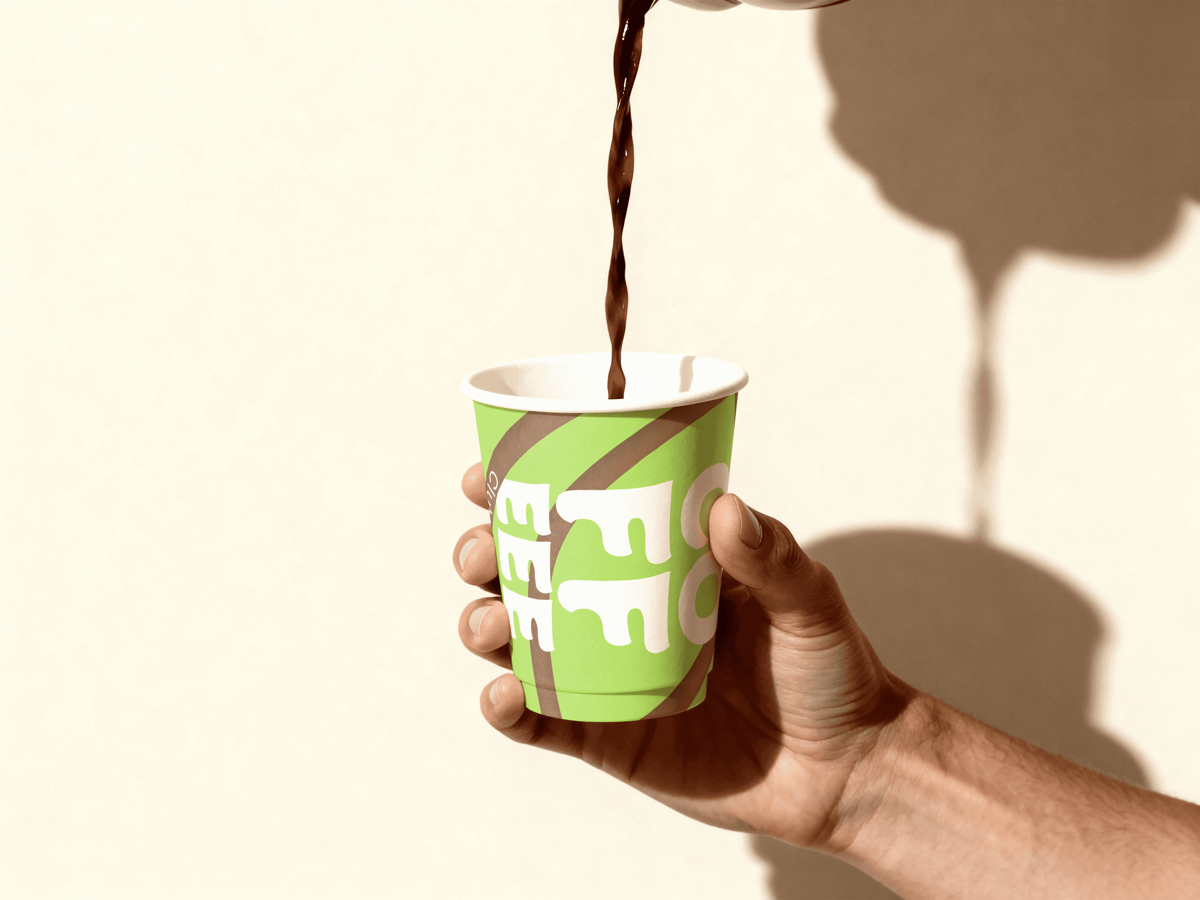
The chosen final identity centers around the stylized, custom-kerned COFFEEE logotype with an extended triple-E structure, representing the lingering energy and buzz of the venue.
Color Palette: A vibrant, non-traditional chartreuse green paired with rich espresso brown and clean off-white canvas backgrounds.
Typography: Bold, rounded display typography custom-tailored for high-impact packaging, signage, and digital touchpoints.
Packaging Design: Applied across takeaway cups, merchandise, and environmental touchpoints to maintain a cohesive, bold visual language.


